Cater Allen Private Bank
 Close
Close
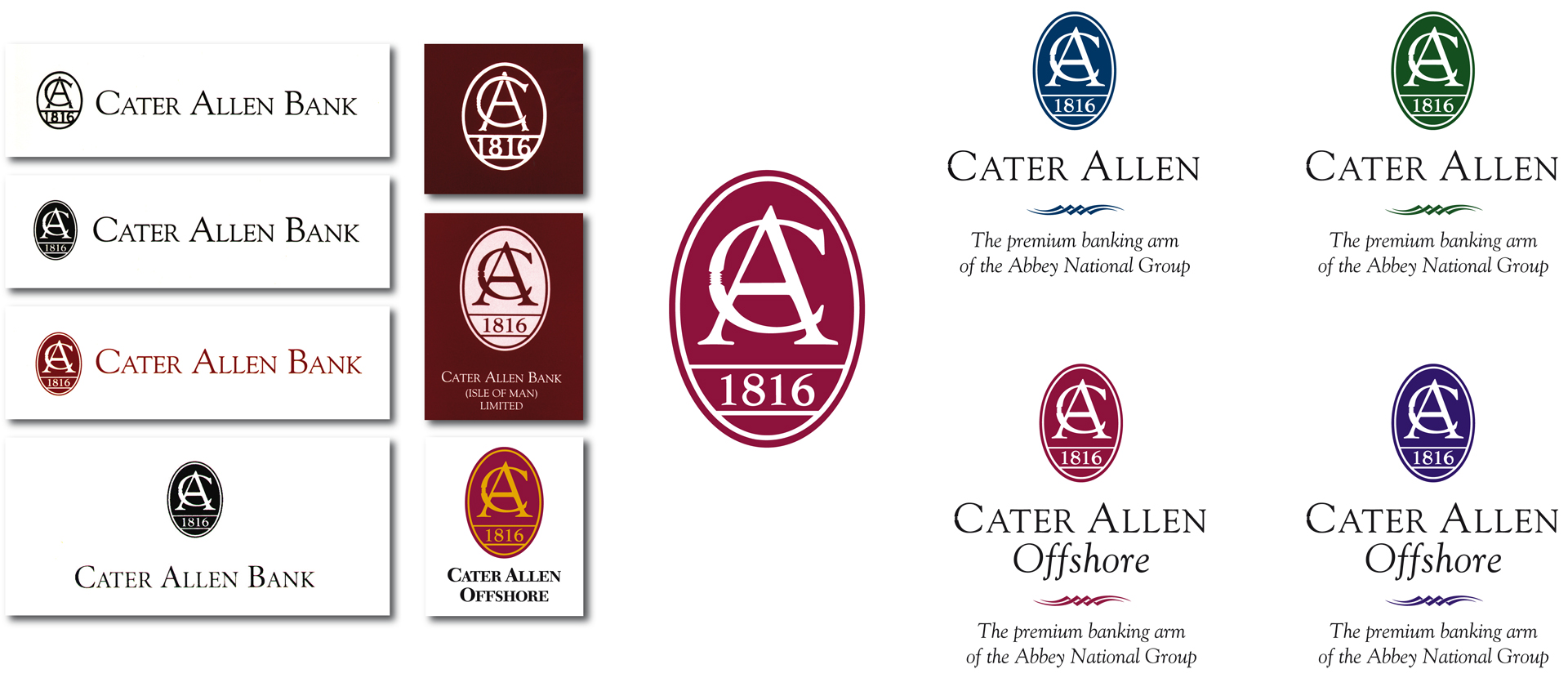
Cater Allen Private Bank Symbols
The graphic imagery of Cater Allen Bank, subsequent to its takeover by Abbey National, was revitalised by FMC International’s consultancy work and by the introduction of a whole new corporate image generated by Equinox Partners.
Jeremy Bond had been working as a Financial Marketing consultant to Abbey National Treasury division with significant success. Word gets around, so it was logical that Jeremy and FMCI should become involved with Abbey National’s ‘trophy’ acquisition of the former merchant bank in Birchin Lane.
Previously, the Bank had a wide selection of ‘logos’ with no significant graphic brand image or guidleines. The original oval was based on a symbol utilised on a late Georgian iron gate to their earlier premises.
Focussing on the selection of one of the symbols, the oval was redrawn and the tag-line of ‘The premium banking arm of the Abbey National Group’ was vital to reinforce the Bank’s credentials and background stability.
One important aspect of the exercise was to ensure that the colours used in materials and advertisements defined the target audiences.
Onshore Customers – Blue
Onshore Advisers – Green
Offshore Customers – Maroon
Offshore Advisers – Purple

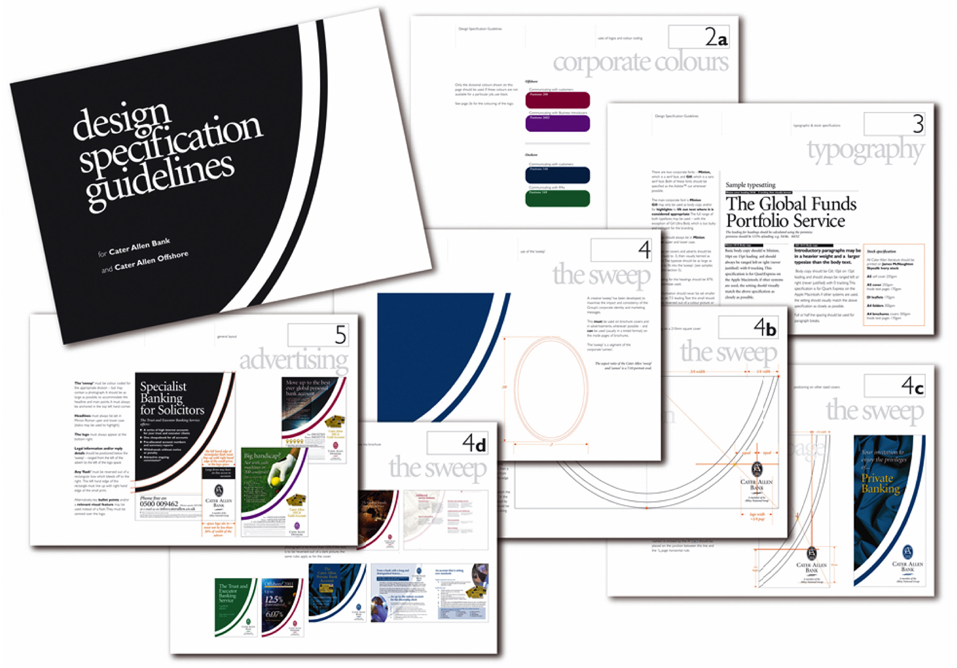
Cater Allen Bank Brand Guidelines
The heart of the revitalisation to a company’s identity, the Design Guidelines capture the essence of the graphic thinking behind a new image and provide instructions to independent sources on how to generate and layout brochures and advertisements, so that they comply with the standards developed.
The existing company logo was rationalised and updated, with an up-lifting ‘graphic sweep’ was applied to all marketing materials to give individuality and distinction, underpinned by the Bank’s relationship with Abbey National in the corporate tagline.
Prepared over the course of many weeks, these Guidelines were developed and prepared by Equinox Partners’ colleague, Paul Davenport, and document all aspects of Cater Allen’s new appearance, from the colours used, the application and position of logos to the choice and use of typefaces and the layout of brochures and advertisements.
A number of marketing campaigns launching Cater Allen’s Private Banking service were supported by national press advertising and accompanied by clear, rational application forms and other documentation. Within 2 years, the Bank had £98m on deposit and was subsequently instrumental in acquiring the Flemings Private Banking business.

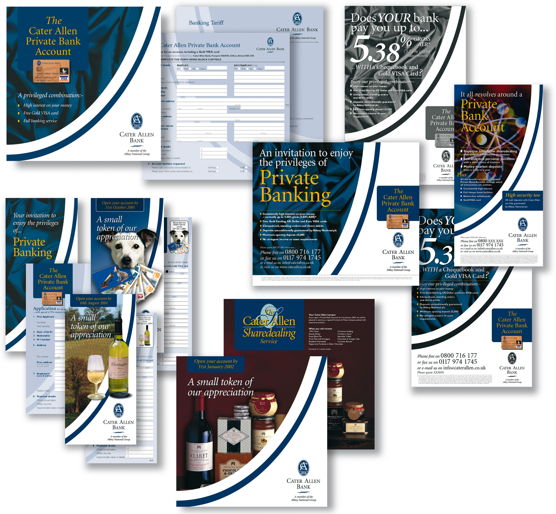
The success of Marketing Materials and Advertisements
The new corporate image with up-lifting ‘graphic sweep’ was developed across the entire range of brochures, direct mail pieces and advertising.
A number of marketing campaigns launching Cater Allen’s Private Banking service were supported by national press advertising and accompanied by clear, rational application forms and other documentation.
This made Cater Allen Bank widely recognised and one of the most successful of the country’s small financial organisations. A similar exercise targeted the all-important Independent Financial Adviser market with colour coding to differentiate the materials for the customer from those instructing the Financial Intermediary.
Within 2 years, the Cater Allen Bank had £98m on deposit and was subsequently instrumental in acquiring the Flemings Private Banking business.

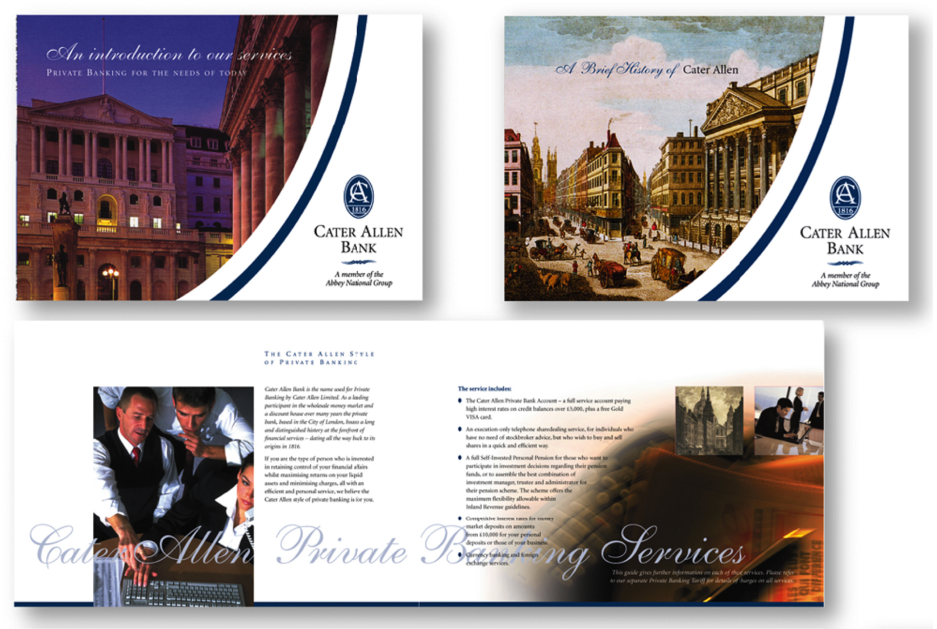
Corporate Booklet
A range of booklets were aimed at reintroducing the bank and its history to their customers and raising awareness of the bank’s services to corporate, legal and accountancy clients.
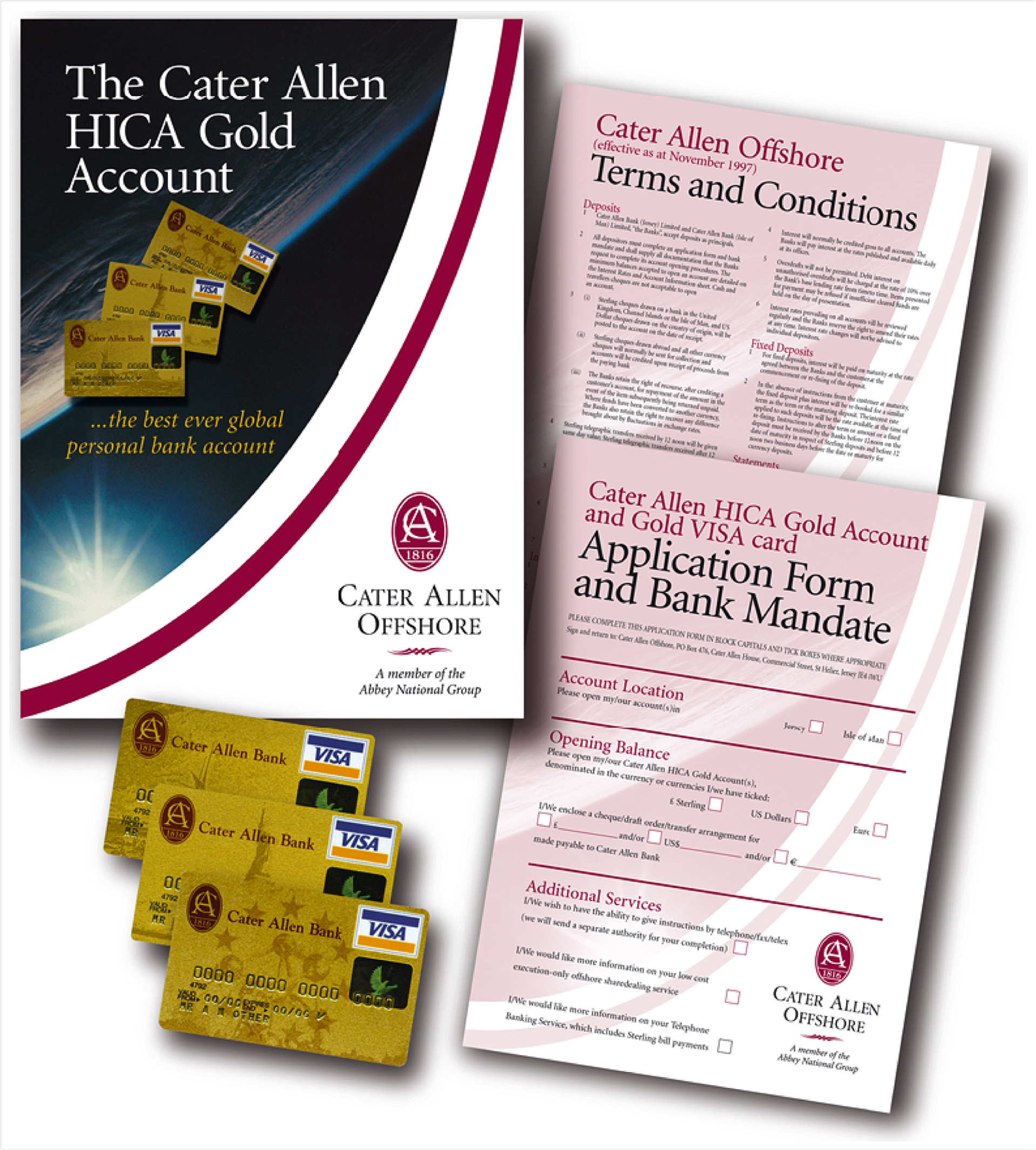
Cater Allen Offshore
Cater Allen Offshore was included in the Cater Allen Private Bank corporate identity scheme, with their own colours and presentation for customers and Financial Advisers located in Jersey, Spain and Hong Kong.
The Cater Allen High Interest Cheque Account (HICA) was of particular interest to British ex-patriates who wanted the benefits of an offshore account in the Channel Islands that rolled up money year-on-year tax-free, paid interest on the balance in the account and provided VISA Debit cards to access their money from anywhere in the world.
Equinox Partners and FMCI generated all the materials around the launch of the HICA, including the three currency VISA cards and creating advertisements for the offshore press.

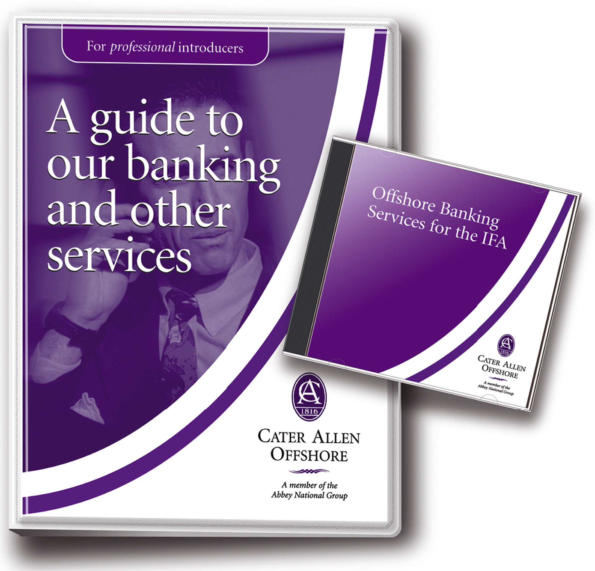
Cater Allen Offshore for Advisers
By providing the best possible materials to offshore Financial Advisers, Cater Allen Offshore was able to target British ex-patriates with a comprehensive banking service, easily understood by customer and adviser alike.
The folder illustrated contained a range of materials under variety of headings, and the CD provided enabled the Adviser to learn, through an audiobook, about the Bank’s services and selling techniques in the car between appointments.

